


While the exact meaning of the initials remains a mystery, we know where Mademoiselle Chanel drew her inspiration: the magnificent stained-glass windows of the Aubazine Abbey, the orphanage where she was placed as a child. Or perhaps it is the emblem of the Château de Crémat, where she stayed as an adult? Regardless, it's thanks to her that this small symbol has been propelled to the rank of modern icon, known and recognized around the world.
Simple, austere, minimalist and monochrome. The simplest things are the ones that stand the test of time the best...
Aubazine
Crémat


The current emblem, dating from 1972, is the finality of a design begun in 1947. It is above all the story of a logo that its creator, Paul Rand, patiently developed within a traditional company, run by bright but conformist people. So he first changed the color, then the font...nothing radical, always in small touches. But it was mostly the addition of the stripes in 1967 that made it instantly recognizable.
Paul Rand recalls: "The idea of stripes came to me when I thought of this type of document on which your signature is protected from counterfeiting by a series of thin strips. By applying this concept to the IBM logo, I was already solving the conceptual problem, but also the visual issue by linking the three letters that tended to visually separate."
Officialized in 1972, this final evolution consists of 13 lines (in 1967), before being reduced to 8 lines due to the capacities of the photocopiers of the time, which reproduced it quite poorly.
1947
1956
1967
1972
Mercedes (1909 - Gottlieb Daimler)
The star on the car hood, quite a symbol. Rarely a logo has so well represented a certain idea of the automobile, the prestige and quality.
The Mercedes logo consists of a three-point star expressing "the dominance of man over land, sea and air". If it exists in a very elaborate version, surrounded by a laurel wreath and stamped with the letters Mercedes-Benz, it's indeed its simplified version, present on top of the hood or on the grille of the most desirable vehicles, that made it an instantly recognizable trademark. The star embodies the image of a brand that the public is able to identify without the name being present.
If the star was registered in the German register in 1909 by Paul Daimler, it was his father Gottlieb, the creator of the brand, who had the idea for this logo by writing a postcard to his wife around 1900. He predicted that she would bring the company immense success and propel it to extraordinary heights. No one will say the opposite, 120 years later...


If the famous beverage was developed in 1886 by Doctor John S. Pemberton, the logo design is the work of...his accountant! He was also the one who suggested the name of the company: Coca for the coca leaves used, and Cola for the kola nuts.
In addition to finding a name for it, partnering with Doctor Pemberton and finding funding to launch the drink, Franck Robinson brilliantly improvised himself as an advertising specialist and gave the drink a decidedly modern style, by adopting as a logo a writing in vogue in many advertisements at the time: the "Spencerian Script". One of the symbols of America, one of the best knowns of our time, did not really stand out for its originality when it was introduced.
While the current logo has remained faithful to the 1886 design, with some retouching such as copyright marks and improved reproduction techniques, there is however a radically different variant printed on the first calendar distributed by Coca-Cola in 1891, which luckily only lasted one year and proves that even the greatest logos sometimes need time to be fully legitimate!

1890/1891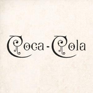


The Sun logo is an ambigram that can be read from various points of view, designed by computer science professor Vaughan Pratt at Stanford University in California. Sun stands for "Stanford University Network" as the company was created by one of its students, Andy Bechtolsheim.
The initial version of the logo, affixed to the manufacturer's early machines, was orange and oriented flat. The logo was then rotated 45 degrees and its color changed to purple and then blue.


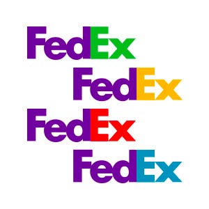
At the time the company was still called "Federal Express" but its CEO, Fred Smith, had agreed to shorten the trade name to boost its image. More than 200 versions of the logo were created, most of them based around the concept of the arrow, before validation of the final version. Fun fact: of all the observers, hardly any noticed the hidden arrow!
Created by Lindon Leader, Senior Director of Design at Landor Associates, this logo is a mixture of two fonts: Futura Bold and Univers 67. Lindon has particularly worked on the concordance of the two by adjusting each upper and lower case to find the ideal layout.
The color combinations used in the different versions of the logo identify the part of the business to which the logo belongs. If the letters "EX" are orange, the logo refers to FedEx Express. A green "EX" refers to FedEx Ground, a red "EX" to FedEx Freight, a blue "EX" to offices and a yellow "EX" to commercial networks.


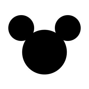
If this silhouette has never been used as a logo, at least not as a representative of a brand, it has established itself over the years as an inseparable symbol in the history of Disney. Specialists attribute the paternity of this design to the creator of the famous mouse, Ub Iwerks, a partner and chief animator of Walt Disney in the 1920s.
Although we haven't find any registration of this logo as a registered trademark, Disney did not hesitate to take legal action in 2014 against the Canadian DJ Deadmau5 when the latter wanted to file in the American register of trademarks what looks like a parody of the famous logo. The two parties finally came to an amicable agreement and the Canadian DJ still uses his famous mouse head today.

The following year, he therefore called on a communication agency located near his premises, and the work was entrusted to a newly hired graphic designer: Rob Janoff. Jobs' only requirement was to avoid creating a "too cute" logo, and Janoff very logically drew two versions of an apple, with and without a bite - the bite-sized version was chosen to avoid confusion with another fruit. He also had multicolored bands added in order to:
- Remind the general public that the most modern machine in the range, the Apple II, had a color monitor.
- Convey a warm and human image, far from the monochromatic image of the very cold and very serious IBM.
Ironically, Steve Jobs removed the color stripes from the logo when he returned in 1998 to give the company a more serious image, and mark the start-up's transition to a very cold and very serious world-class industrial complex.


Its inception dates back to 1863 when Henry Dunant, a Swiss businessman, arranged an international conference with representatives from 14 different countries to establish a society providing the necessary care for wounded soldiers on the battlefield. It was on this occasion that delegates adopted the cross as a distinct emblem, formally identifying personnel and medical facilities even in the midst of fighting.
Recognized by the Geneva Convention since its creation, this symbol appears like a Swiss flag with inverted colors. It has also been designed to be able to be manufactured quickly in places where the materials for its making may not be easily available, and to be perfectly recognizable from near and far.
This logo has two other variations: the Ottoman Empire, which had initially accepted the badge of the Red Cross, considered in 1876 the cross to be a Christian symbol and an emblem reminiscent of the Crusaders - so they created the Red Crescent, quickly adopted by other Muslim countries and accepted as an alternative in 1929. Then the Red Crystal, created in 2005, and intended for those who for cultural or operational reasons choose not to use the cross or the crescent.


It was imagined by Carolyn Davidson, a Portland student in 1971, as a representation of speed and movement, giving the impression of propelling each shoe inevitably forward. This apparent simplicity was difficult to achieve, and Carolyn spent nearly 18 hours creating a visual that she deemed sufficiently impactful. He had to take production techniques into consideration, ensure that it was readable on a wide variety of materials - from shoes and t-shirts to cardboard boxes or glossy advertisements - and differentiate it sufficiently that of competitor number one: the German giant Adidas.
To achieve her ends, Carolyn employed a technique still used today by modern graphics software: drawing half a dozen essays on tissue paper and placing them on top of a shoe, the way of a layer, to test his ideas and choose those that can be presented to the founder of the brand. This one opted for Carolyn's favorite project: the famous Swoosh. Not without denigrating it by saying "I don't like him, but maybe he will grow in me."
Until 1994, the official Nike logo featured the name "NIKE" in a variation of the Futura font, in all caps and surrounded by the Swoosh. In 1995, in the interest of simplification, Nike made the decision to use only the Swoosh as a company logo and continues to use it that way today.


If you need a new logo for your business, keep in mind that a high price is not a guarantee. Many examples prove it and it's not the founder of Nike who will tell you the opposite! Favor simple designs, with few colors; these are the ones that best resist fashions.
And check out DocLogo.com to find out what a modern logo generator can do for you!