Cookies

This website uses cookies to provide you with a great user experience.
You accept that by continuing to use it .
By using DocLogo.com, you accept our use of cookies .
OK  
 

Flag

Article

Analysis of a redesign: Burger King, 2021
Retro is all the rage, and Burger King innovates by rediscovering its past. So 70's!
portrait
By Sylvain Denans
January 11, 2021
Share this article on
Facebook
Twitter
VKontakte
article image
Burger King is one of the best known companies in the world. The brand has been able to forge an offbeat image and position it as an identifiable element in an ultra-competitive sector, which has naturally allowed it to become part of the consumer's imagination.

The solidity of its image is such that on several occasions, Burger King was able to launch advertising campaigns considered risky. Even recently, the sponsorship of one of the least recognized soccer teams in the world in order to appear at a lower cost in a very popular video game, or even when in the midst of a global pandemic, Burger King France recommended to its clients...to go to McDonalds, in order to support a catering sector that had been severely tested by successive confinements. Burger King specializes in amazing marketing strategies to get people talking about the brand.
photo
photo
Changing the image The fast-food chain launched a new visual identity in early 2021, with colors, graphics and typography dating back to the company's origins. The result of a process that lasted more than two years, the first major change for Burger King in nearly a quarter century.

This logo is very much inspired by the logo used by the brand from 1969 to 1999, and Fernando Machado, general manager of Burger King's parent company "Restaurant Brands International", says that "the main difference now is that we have adjusted the color to make it more vivid and closer to the true color of the food. And we have adjusted the proportions of the muffin so that it looks more like the products we sell, delicious and round like our food".

This change does more than evoke the nostalgia of the brand's most loyal fans; the current logo has not aged well and has simply not withstood evolution, especially in terms of digital experience. Inspired by an authentic and delicious kitchen, the new design, which is both more modern and more vintage, will more accurately reflect Burger King's values.

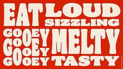
This new identity is the beginning of a new stage of a Burger King with a more real taste, more appetizing and fresher. This includes the brand's commitment and willingness to make the most of the digital shift in a post-Covid world, recent improvements to improve food quality and taste by eliminating preservatives, artificial colors and artificial flavors, and a commitment strong in favor of sustainable development.

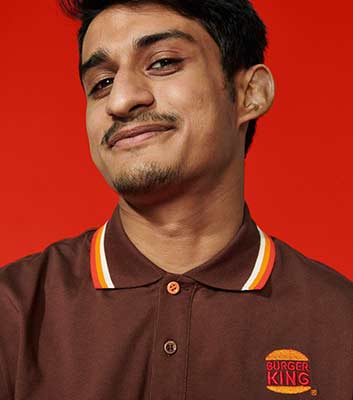
Today more than ever, Burger King wants to make sure its customers feel good with the brand's catering offer. This effort is reflected throughout this new design, both in the visual identity but also in the entire user experience, from taking an order on a smartphone, to its collection in the restaurant, to the unpacking of the products.

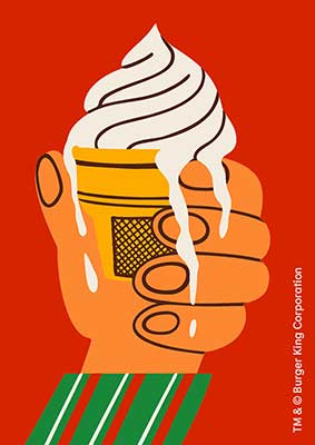
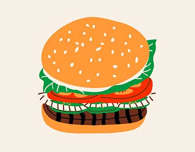
In addition to the new logo, the brand also presents packaging, furniture, posters, restaurant decoration, as well as everything necessary for its digital offer, including social networks. The result is a new look for a brand that looks to the future without denying its heritage.
photo
photo
photo
photo
photo
Logo Designed by the Jones Knowles Ritchie agency, this new logo pays tribute to the brand's heritage with a simple and fun design. Where the old logo used false shine effects on bread, which is an aberration, the new logo embraces the flat design movement. Another advantage of this logo is that it is perfectly readable on small supports, like your smartphone.
photo
photo
Monogram In addition to the logo, a monogram "BK" was created by Stephen Kelleher Studio and it's hard not to admire it. The "B" and the "K" are clearly distinguishable and this is exactly the kind of monogram that every graphic designer dreams of creating: simple but unique. We believe that this monogram should be unanimously appreciated by consumers and design enthusiasts alike.
photo
photo
Color The colors chosen are eye-catching, inspired by the fresh ingredients used to make the hamburgers. The sensory aspect of the food is very well highlighted in the new illustrations used by the brand. There is a slight vintage trend, with a dominant brown (on the staff uniforms in particular) and a slightly pastel touch, as in an old photograph.
photo
photo
photo
photo
Typography Burger King's new font is aptly named "Flame". It is inspired by the rounded shapes typical of the 70s and corresponds well to the irreverent personality of the brand. It bears a strong resemblance to "Cooper Black", the famous 70s typeface ironically designed in 1922!
photo
photo
photo
Packaging The new packaging proudly displays the new logo, along with beautiful colors and fun illustrations of the ingredients. Here too, a strong resemblance to the 1970s is evident; the groovy writing would not have been out of place on the poster of an "Austin Power" movie or on the cover of a "Jimi Hendrix Experience" album.
photo
photo
This new identity will be implemented in the brand's American restaurants in the coming weeks. Burger King intends to implement this new design in restaurants around the world, but there is still uncertainty about the timing depending on the country.


Do you also want to boost your brand image? We've developed a generator capable of creating the perfect logo automatically through the use of artificial intelligence, come and discover it on DocLogo.com! Developed by real graphic designers and validated by real professionals, it will allow you to create your logo in less than a minute for a fraction of the real cost of a graphic designer. It's revolutionary and we're very proud of it!
Follow Sylvain on

Footer


All Rights Reserved - DocLogo 2020 -


Facebook | Twitter | VKontakte

Modals