Cookies

This website uses cookies to provide you with a great user experience.
You accept that by continuing to use it .
By using DocLogo.com, you accept our use of cookies .
OK  
 

Flag

Article

Pantone, trend-setter for 20 years
The Pantone Color Institute unveils each year, during the first days of December, the new color of the year. How did this company come to define the trend of colors in sectors as varied as hotels, fashion or wall painting of your living room?
portrait
By Sylvain Denans
December 31, 2020
Share this article on
Facebook
Twitter
VKontakte
article image
The most popular color matching system in the world is the Pantone system. First introduced in 1963 to address the complex issue of pigment blending in the printing industry, Pantone has become the fastest and most reliable way to identify and match colors through its catalog. A number is assigned to each pigment, in each tone and hue, to distinguish it. For over 65 years Pantone has been the color matching system of choice not only in the design industry but also for plastic, paint and textile manufacturers. Pantone Color of the Year The Pantone Color of the Year, a revolutionary idea for promoting the company, was created in 2000 by the Pantone Color Institute. The Pantone Institute offers the opportunity for artists, advertisers, producers and brands to collaborate together to create a clear and effective color presence. They are experts in the influence of color on fashion and consumption and their efforts to raise color awareness is unprecedented; it's no surprise that in December of each year the reveal is eagerly awaited. Influence on marketing To focus on the next Pantone color of the year, the Pantone Color Institute conducts research on color trends throughout the year. They take into account all the elements of culture: fashion, marketing, social networks, politics...the trend is not based on polls and polls, but is directly chosen by a committee that designates the color. In the world of design and brands, the color chosen has more and more influence every year. Pantone tools The first color of the year was selected in 2000. Today, when a color is announced, Pantone immediately offers color enthusiasts a range of items, design tools and color charts specially designed with that shade. in mind.

An assortment of Pantone Color System tools are available to graphic designers, fashion designers, makeup artists, interior designers and product suppliers for the development of designs and articles. Pantone itself maintains a range of products that are renewed each year with the new color: mugs, key rings...Adobe Stock and Pantone also join forces to offer a selection of images in the color selected by Pantone.
photo
photo
photo
The "other" colors of the year Many other companies, including paint manufacturers, have sniffed out the vein and are trying to exploit this unexpected trend in their own way. These include Dulux, Benjamin Moore, Sherwin Williams, and others.

Where Pantone achieves better results than others is not in the choice of colors, but in the associated marketing. Pantone's "prediction" is a self-fulfilling prophecy: the company enters into licensing agreements with several companies months before the official unveiling in December, so that the same hue materializes in various products. The color is also widely distributed in the fashion world well before December, so designers have the opportunity to use the hue in their collections for the year.

And that's why, barely the color unveiled, we notice it everywhere!
photo
photo
photo


The Pantone Colors of the Year from 2000 to 2020 2020: Classic Blue 19-4052 A true return to the roots, this blue is close to the "Cerulean" blue of twenty years ago! The "Classic Blue" demonstrates a sense of confidence as we enter a brand-new decade. This deep blue is traditional, timeless and beautiful.

The impression offered by this color is a little surprising; it's a color we are used to observing around us, but this one looks new, different. This was precisely the primary concept, according to the Pantone Institute. To enjoy a color that, while recognizable, is different from the usual blue.

Some people have, in hindsight, ironically stated that this blue could have been lighter to represent the color of the protective masks used during the COVID 19 epidemic.
photo
photo
photo
2019: Living Coral 16-1546 A massive success: coral tones in cosmetics were seen everywhere throughout the year, fashion shows had coral-colored clothes all season long, and many wallpapers and coral fabrics were created for interior decoration.

According to Pantone, "Living Coral" was "an animating and life-affirming coral hue with a golden undertone that energizes and enlivens with a softer edge". The bright tone of "Living Coral" was set to bring warmth to all.
photo
photo
photo
2018: Ultra Violet 18-3838 The selected color for 2018 was "Ultra Violet". According to Pantone, this color reflects the mysticism of the cosmos; the influence of what is invisible, makes the imagination work and increases creativity tenfold, in part thanks to a name that adds a touch of magic to the color; true ultraviolet is invisible and can't be touched with the finger, unlike this one.

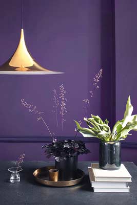
Purple is traditionally linked to spirituality and mindfulness, and this color includes a zest of science in the same package.
photo
photo
photo
2017: Greenery 15-0343 "Greenery" represent the color of the year 2017. Nicknamed "Nature's neutral", "Greenery" was the color of early spring and new beginnings. The theory behind "Greenery" is that when you see the color, you can immediately imagine the great outdoors and the call of nature. "Greenery" represents the increasing presence of nature in architecture, fashion or design.
photo
photo
2016: Rose Quartz 13-1520 and Serenity 15-3919 In 2016, for the first time, Pantone chose two colors (the second time in 2021). The "Rose Quartz" and the "Serenity" together embody the search for well-being and stability. The mix of warm pink and cool blue challenges the conventional expectations of gender distinction. These colors reflect a social evolution that increasingly advocates gender neutrality in the fashion world, and increasingly infuses other areas of design.
photo
photo
photo
photo
2015: Marsala 18-1438 The color of the year 2015 evokes wine and earth with its shades of brown and deep red. A rich and shimmering tone, which is well suited to the furniture of a home or those of a quality kitchen. The "Marsala" harmonized quite well with carpets and curtains, either as the prime attraction of a room or as a contrasting color.
photo
photo
2014: Radiant Orchid 18-3224 "Radiant Orchid" is a color that stimulates and encourages the imagination, a joyful and confident hue. "Radiant Orchid" has rapidly found its place in the world of fashion and beauty. From red carpets to stores throughout the country, this color has been incorporated into many men's and women's ready-to-wear collections throughout the year.
photo
photo
2013 : Emerald 17-5641 The color of the jewel, "Emerald" was the color of the year 2013. Elegant and glamorous, this deep green is a representation of rebirth, harmony and positivity. With its rich tones, "Emerald" was well suited to fashion, and some companies also launched furniture collections, proof of great versatility when this color is used properly.
photo
photo
2012 : Tangerine Tango 17-1463 The "Tangerine Tango" represented the hue of progress. The color adopted in 2012 was vivid, seductive and evoked a lovely orange sunset. Lively and seductive, it influenced many designers in their collections that year.
photo
photo
2011: Honeysuckle 18-2120 The color of the year 2011, "Honeysuckle" pink, was a captivating color that encouraged fun and creativity. "Honeysuckle" was a pretty, stimulating hue that shared many positive attributes with another closely related color: red.
photo
photo
2010 : Turquoise 15-5519 The "Turquoise", color of the year 2010, is both a tropical color and also that of a powerful and protective talisman. "Turquoise" is an important hue in the color scale because of its positive acceptance by both men and women. This color also goes well with earth tones, brown for example.
photo
photo
2009: Mimosa 14-0848 "Mimosa", the Pantone color of the year 2009, was initially named after the mimosa flower, but is also known as the color of the cocktail of the same name composed of champagne and orange juice. "Mimosa" was used as a vibrant and energetic color that motivated creativity in a period of high economic instability.
photo
photo
2008: Blue Iris 18-3943 In 2008, "Blue Iris" was chosen as the color of the year for its qualities that can inspire a meditative state, with its blend of blue and purple. For interior decoration, this hue can easily be combined with deep plums and red browns.
photo
photo
2007: Chilli Pepper 19-1557 The Pantone color of the year 2007 was the first to be revealed in a press release describing the motivations inspiring his choice, after the initial color in 2000. "Chilli Pepper" was the flavor of burning passion and a spirit of adventure. After her, each color came with more and more history and details about its creation.
photo
photo
2006: Sand Dollar 13-1106 In 2006, the color of the year took on a neutral tone with the "Sand Dollar". It was elected in response to concerns about the economic problems of the time; which may make people smile today, but no one knew the real storm was coming soon. This neutral hue proved to be very successful in interior design and fashion, with shades reminiscent of the long sandy beaches and dunes of the desert.
photo
photo
photo
2005: Blue Turquoise 15-5217 As in the previous year, the color of 2005 was influenced by nature: "Blue Turquoise". It's the ideal shade of the Indian Ocean on a sunny and peaceful day. "Blue Turquoise" differs from real turquoise by containing less green, giving it a bluish hue.
photo
photo
2004: Tigerlily 17-1456 "Tigerlily", unveiled in 2004 by Pantone, was a strong combination of red and yellow to encourage creativity. Inspired by the flower of the same name, this color was created to show how nature is able to inspire architecture. It also works wonderfully well for ready-to-wear.
photo
photo
photo
2003: Aqua Sky 14-4811 The color of the year 2003 was "Aqua Sky", a fresh and peaceful blue chosen to restore hope and serenity. It's the first turquoise-inspired hue, a tone that has come back several times in the colors selected by Pantone over the years.
photo
photo
photo
2002: True Red 19-1664 Despite its resemblance to the previous year's color, "True Red" was selected in 2002 as a patriotic reminder of the events of September 11. This color is a very symbolic hue, which beautifully embodies the brave and fallen of that fateful day.
photo
photo
photo
2001: Fuchsia Rose 17-2031 A lively and passionate color, "Fuchsia Rose" was chosen to contrast with the previous year, driven by the desire to differentiate itself from the "Cerulean" blue of the year 2000. For its second year of existence, Pantone took no risks and opted for a pleasant but ultimately classic color.
photo
photo
2000: Cerulean 15-4020 To represent the new millennium with an image of tranquility and peace, Pantone selected "Cerulean" blue, also called "color of the millennium". As it was the very first "color of the year" in history, Pantone also issued a statement to explain its origin, which will become a habit from 2007.

Pantone believed that consumers would seek inner peace and fulfillment in these uncertain times, and therefore chose this soothing hue that is reminiscent of the sky and because, regardless of gender or nationality, blue is a universally appreciated color.
photo
photo
photo
Thanks to Kata Kocsis for the photos and inspiration!

You want to create a logo with gorgeous colors like the Pantone color of the year? We have developed a logo generator that can automate this process, come and discover it on DocLogo.com! Developed by real graphic designers and validated by real professionals, it will allow you to create your logo in less than a minute for a fraction of the real cost of a graphic designer. It's revolutionary, and we're very proud of it!
Follow Sylvain on

Footer


All Rights Reserved - DocLogo 2020 -


Facebook | Twitter | VKontakte

Modals