


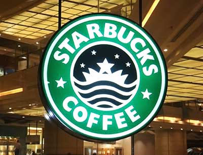
In this small world, Starbucks is a giant. Founded in 1971 as a coffee bean retailer in Seattle, the company is now the world's largest coffee chain, with more than 31000 stores in 76 countries. The Starbucks logo and cups have a recognizable appearance, invariably attracting curiosity. The mermaid icon is one of the best known and most popular consumer logos, especially in North America. It is no exaggeration to say that this image has contributed to the success and growth of the company, capturing the attention of passers-by around the world.
The brand has long used marketing to continue its growth and introduce its products in new countries. In the late 1990s, when it was still a small North American coffee chain, it was already using product placements in popular movies and series to expand its customer base. As a result, its cups and logo were discovered in Europe, where it is now as well known as in its home country.
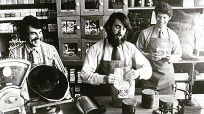
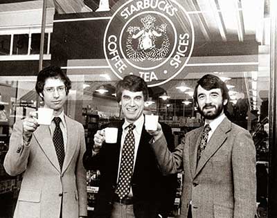
Starbucks transformed a popular beverage into a luxury drink with the support of relentless marketing, far from the spirit of the first store opened in 1971 and announced by a simple little wooden sign. From a simple neighborhood roaster to a mastodon controlling a portion of the world's coffee production, how did their logo evolve? Starbucks Logo - History and Origin Starbucks was founded in Seattle on March 30, 1971, by three partners: Jerry Baldwin, Zev Siegl and Gordon Bowker. At the time, it was one of Seattle's many waterfront roasters looking for a way to stand out from the competition while conveying the maritime spirit. According to the official version, the three collaborators decided to hire a consultant, Terry Heckler, for this task, who, by rummaging through old seafaring books, finally spotted an emblem based on a 16th-century Norse woodcut, in the shape of a two-tailed mermaid.
Greek mythology told that mermaids lured sailors to shipwreck - a welcome analogy for a small brand wishing to attract coffee lovers to its lair.
The company was originally to be named "Cargo House" or "Pequod" after a ship from Herman Melville's "Moby Dick". But the name was unusual, to say the least, and Terry Heckler was able to convince the trio to change the company name to "Starbucks", Pequod's first companion.
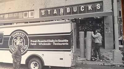
It was he who gave the brand a national and then international dimension, successfully testing the sale of takeaway coffees in the company's sixth store. After refusing to expand the concept out of ideology and because they believed Starbucks should remain a small company, after a period of hesitation and the resignation of Howard Schultz in 1986 to create his own establishment, the founders of Starbucks ultimately sold him the stores and the name a year later, in 1987.
After the takeover, the original name "Starbucks Coffee, Tea and Spice" was shortened to "Starbucks Coffee", the brand specialized in the sale of take-away coffees and began a very aggressive development, with nearly three stores open daily since 1987. With the exponential increase in popularity of Starbucks, its logo is now one of the world's best-known symbols.

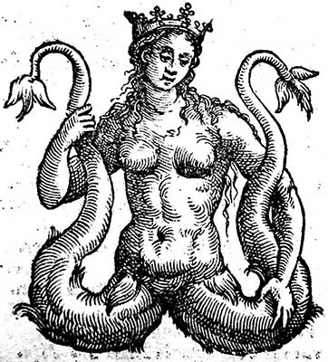
1971 - The original Starbucks logo depicts a mermaid, topless, with a crown, double fishtail and belly button fully visible. This is the first time this motif has been used, found according to official history on a 16th-century Norse woodcut, most likely in a European book about Melusina, a fairy found in several medieval works.
The style is already very close to today's logo, with the two circular rings around the legendary figure and the name of the company written in capital letters. The only major difference is the color: everything is in a brown palette, to recall the color of coffee.
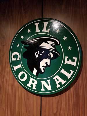
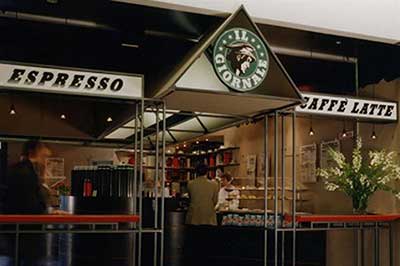
The color actually comes from the logo of the company "Il Giornale", founded by Howard Schultz a year prior and merged with Starbucks during the takeover.
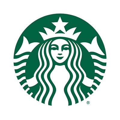
Officially, the removal of the name has offered the brand the freedom and flexibility to move away from coffee. The image of the siren is now so well known that it is no longer necessary to have a name associated with the logo for the public to recognize the brand. Nike or Mercedes have made the same deduction in the past and came to the same conclusion.
This logo has not been enthusiastically received, neither by designers nor consumers, and the brand has been severely criticized for this change. Yet, whether on t-shirts, websites and other commercial objects, this logo is a must and seems to fit perfectly. The critics never questioned its intrinsic qualities, but it simply suffered from replacing a much-appreciated logo that did not need to be changed.

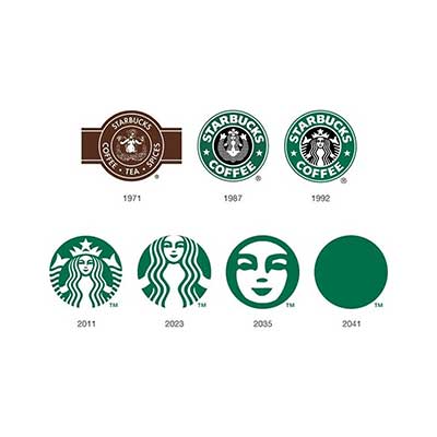
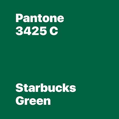
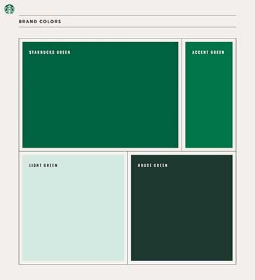
The popular Starbucks logo features a pretty prairie green, now widely associated with the brand. The closest Pantone color is "3425 C", although this reference is not official.
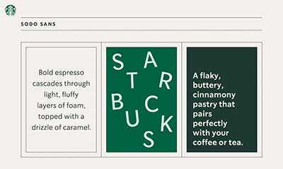
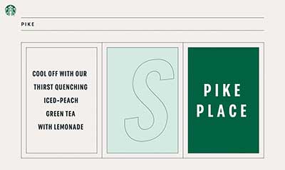
The first version of the logo featured a font called "Futura Medium", a classic among sans serif fonts. Later versions of the Starbucks logo used a custom, bolder font. Today, the company uses three fonts depending on the circumstances: "Sodo Sans", "Lander" and "Pike". The best known, which is the one used on the logo, is "Sodo Sans Black".

Officially, the iconic Starbucks logo is a design by Terry Heckler, who, while researching old books about the sea, discovered the icon of the two-tailed mermaid, based on a 16th-century Norse woodcut.
The problem? By the time woodcut images first appeared in medieval Europe, around 1400, there was no one left who could be called "Norse". Oops!
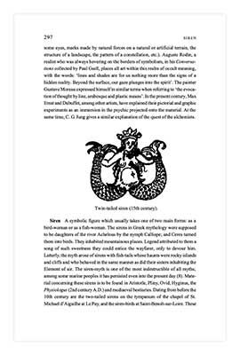
It is much more likely that the three businessmen, looking for a symbol for their new café, turned to the American edition of Juan Eduardo Cirlot's Dictionary of Symbols - whose second edition was, coincidentally, published a few weeks before the opening of the first Starbucks, and which, by chance, contains a drawing almost identical to the said logo on page 297! Let's bet that the company simply wanted to make this story of discovery a little more attractive.
This mermaid, called a Melusina in Europe, is found in many medieval tales, often depicted with a crown and double tail in its Germanic version. There are also traces of close drawings in Italy, Venice or in the cathedral of Otranto in the province of Lecce, on a mosaic dating from the twelfth century.
Nevertheless, thanks to its unique design and complex features, this icon remains one of the most memorable modern emblems.